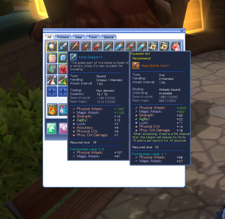
Recent local development work has included looking at tooltip readability: how information is presented, how text fits, and how the details of an item can be understood at a glance.
Clarity in the little moments
You spend a surprising amount of an adventure looking at the small things. A useful description can make choosing equipment, comparing an item, or understanding a new discovery feel more natural. Making those moments readable is part of the work underway.
These are local development notes. They describe work being explored and reviewed, rather than a public release. Text, layout, and presentation may continue to change.
One step at a time
This work is not an announcement of a complete English translation or a finished client. There is still more to do, and we’ll keep sharing focused notes as individual pieces take shape.
For now, it’s one small step toward making a familiar adventure easier to enjoy.
More room for your adventure
The local Windows client has also been tested at 4K resolution. The launcher starts the game in borderless windowed mode by default, filling the screen while making it easier to switch to other apps.
The launcher follows Windows display scaling to help keep the interface readable on high-resolution monitors. Scaling above 150% is still being refined: some panels and text do not yet resize consistently. This remains work in progress, rather than a finished interface overhaul.